
What Is Responsive Web? Comparing the Similarities and Differences with Adaptive Web | Wotech Electronics
Vũ Khôi
Tác giả tại Wotech Electronics Blog
What Is Responsive Web? Comparing the Similarities and Differences with Adaptive Web?
Vũ Khôi
Author at Wotech Electronics Blog
"What is responsive web?" is probably no longer an unfamiliar question to the tech world, especially amid the 4.0 industrial revolution, centered on the development of information technology, which is sweeping the globe ever more strongly. What is the meaning and role of responsive web designs?
What is responsive web? Finding the definition of a Responsive Website
Even though many of you surely already know what responsive web is, in this article we still want to reintroduce the concept for those who don't. A Responsive Website is a concept in the design field whereby, when a website is responsive, it can display well across many types of devices/browsers with different screen/window sizes.
But what are the signs of good display in a responsive web? A website is considered to display well when the design elements on the site meet the following conditions:
-
Users can read text clearly without zooming in on the screen
-
The web interface has enough space for users to perform actions (for example, accurately tapping CTA buttons, menus, etc.)
-
Users no longer have to scroll horizontally to finish reading the content
For example, when someone views the site from a desktop or laptop, the navigation menu is laid out horizontally, while if the user accesses the website from mobile devices such as a smartphone or tablet, the menu displays vertically down the screen. In addition, the font size is enlarged and the text layout changes to suit the smaller screen, making it easier to read.
What is the difference between adaptive web and responsive web?
Have you ever wondered what adaptive web and responsive web are? Are these 2 definitions actually different? Adaptive web design uses separate layouts for multiple screen sizes, with the layout depending mainly on the screen size being used. Put more simply, the designer creates a dedicated layout for each screen size.
So what is responsive web and how does it differ from adaptive web? Responsive web design allows the website to adapt to the size of the screen regardless of what the target device's screen size is. This type of web design uses a "fluid" layout and CSS media to change the visual style. This "fluid" layout lets the page change its width and height to adapt to different screen sizes and display correctly. In other words, with responsive design, the designer does not have to create multiple versions of the same website to increase its displayability across a wide range of devices.
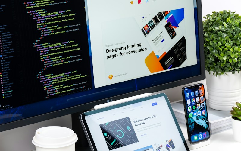
What are the minimum things to know before deciding between adaptive and responsive web?
What is the most important difference to note between the adaptive and responsive web design approaches? It is that adaptive interfaces are far less flexible than responsive web design. If you choose to build your website the adaptive way, you need to design separately for each different screen size, and this causes considerable expense and difficulty when you don't have enough resources and manpower for every type of screen.
What reasons prove the importance of responsive web?
What impacts is the current trend having on responsive web designs? We live in a society where, every day, people probably spend more time looking at screens than at the faces of the people around them (sad but true!). But precisely because of this, in the competition of online advertising, the more present and impressive your website and image are across digital media, the better your chances of winning.
However, the number and variety of electronic devices keep growing. Today, most people have their own smartphone, and going online from these devices is no trouble at all. 52% of web traffic currently comes from mobile devices, and 2/3 of total user web time also comes from these devices.
Clearly, the rapid growth of mobile device users, now overwhelming those who access the web via traditional computers and laptops, leaves big search engines like Google unable to stay out of the game. Since this giant issued its policy to index and rank websites, designing a responsive website has become more important and necessary than ever. Let's go over the benefits responsiveness brings!
What benefits does a business get from responsive web?
What is the first change you will see from responsive web? It is increased reach to customer groups using mobile devices (tablets, smartphones). In addition, the flexible yet consistent design can help you increase your chances of reaching and retaining potential customers, thereby raising conversion rates and, ultimately, sales. Investing in a responsive website from now on means you will lead the market and stay ahead of competitors, especially if you work in fields that rarely use or require updating knowledge of information technology.
Beyond greater reach, what other advantages does responsive web offer?
To continue listing the benefits we can get from responsive web, we cannot fail to mention convenience in management. When you have a website with a responsive design, you can quickly and easily change both the interface and the content when needed. This flexibility is a huge advantage when you just want to make a quick design tweak or fix a typo on your website. You only have to do it once, whereas with adaptive web, it is easy to see that editing multiple versions of the website costs time and effort. From this comes yet another benefit: reducing the time, cost, and effort needed to analyze, monitor, summarize, and report on the website's operating status.
What are the mouse-and-touch issues in responsive web design?
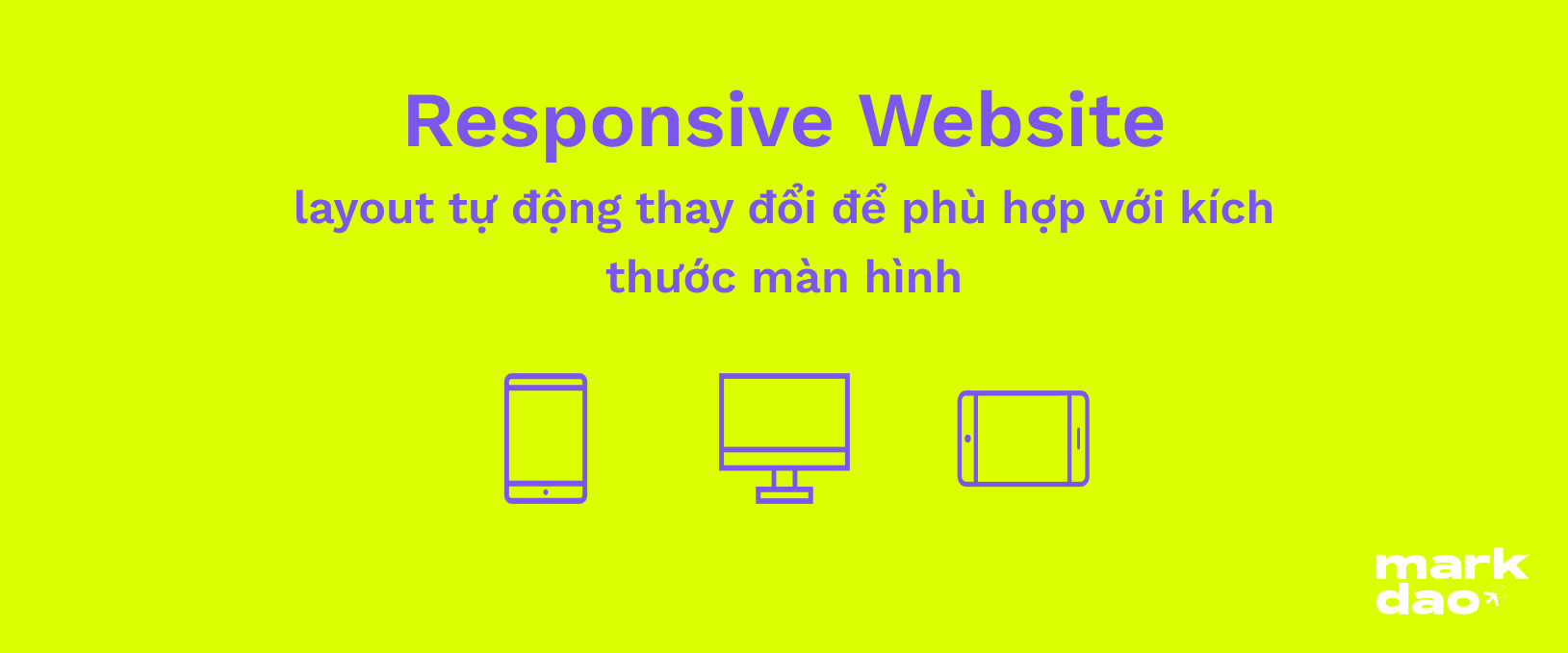
What is the relationship of touch and mouse in responsive web? Responsive design for mobile devices poses challenges for developers and designers related to the different natures of using a mouse (on desktop/laptop) versus touch (on mobile devices). What exactly is the difference between mouse and touch in responsive web design? On a computer, users typically use a mouse (an external mouse or keyboard-driven mouse) to navigate and click on the item they want. On a smartphone or tablet, users mainly use their fingers and tap the screen to control things. Compared with mouse control, which is easy and highly precise, selecting a small point on the screen by tapping with a finger is far less accurate. Web designers must consider making the website responsive so that users have enough "space" for every tap to navigate accurately.
What other considerations matter when designing a responsive web?
Beyond the keyboard and mouse, what issues need attention in responsive web? Graphics and web loading speed. Of course, a website with beautiful graphics will attract and impress more users. However, as a designer you must account for the fact that when users browse the web on mobile devices, the mobile network they use may not be suitable for loading these effects, which slows down the site's loading speed. This directly affects the user's decision to abandon the page. So for the versions of the website displayed on mobile devices, it may be wise to show fewer graphics than in desktop views so that the site doesn't take forever to load on a smartphone.
Related Articles
Bài viết liên quan

25 tháng 10, 2026 · 3 phut doc
2024年网页设计趋势预测如何? | Wotech Electronics
关于 2024 年网页设计趋势——步入 2024 年,年初正是我们为新事物预留时间的时刻。这也非常适合设计师群体唤醒我们内心的"艺术之魂"。闲话不多说,快来和 Markdao 一起浏览 2024 年的 UX/UI 设计趋势吧,说不定您就能为自己接下来的网页设计项目"迸发"出一个绝妙的点子呢!

25 tháng 10, 2026 · 1 phut doc
什么是网站(Website)?网站的详细定义及其带来的商业价值
什么是网站(https://www.markdao.com.vn/blog/website-la-gi)——这个问题或许已经无需定义,因为在如今这个信息时代,网站对每一家企业而言都是不可或缺的组成部分。正是网站帮助用户更近距离地接触企业所提供的产品和服务,从而提升经营效益。此外,要在当今竞争如此激烈的环境中求发展,网站是一个重要因素,它将带你走向品牌与销量上的双重成功。
25 tháng 10, 2026 · 1 phut doc
什么是SEO标准网站?一场"打赢"Google SEO标准的战役 | Wotech Electronics
99%的用户在购买前会先搜索信息,73%的用户只会访问排名前10的网站,并认定它们是值得信赖的品牌……在数字营销爆发的时代,这些数字有力地印证了SEO标准网站的重要性。然而,许多人对什么是SEO标准网站(https://www.markdao.com.vn/blog/huong-dan-toi-uu-seo-website-chuan-seo-on-page)仍然相当模糊,并未真正理解。达到SE…