Polished Corporate Website Design – How to Combine Fonts? | Wotech Electronics
Vũ Khôi
Tác giả tại Wotech Electronics Blog
Polished Corporate Website Design – How to Combine Fonts?
Vũ Khôi
Author at Wotech Electronics Blog
Website design is essential work, because the website is the face of a business — the channel through which its products and services are introduced in the most systematic, professional way. For that reason, website design deserves proper investment and attention from business operators. Among the elements a professional corporate website design needs, using and combining the right fonts is absolutely essential. Let's dive into this fascinating topic right now.
Why do fonts matter in website design?
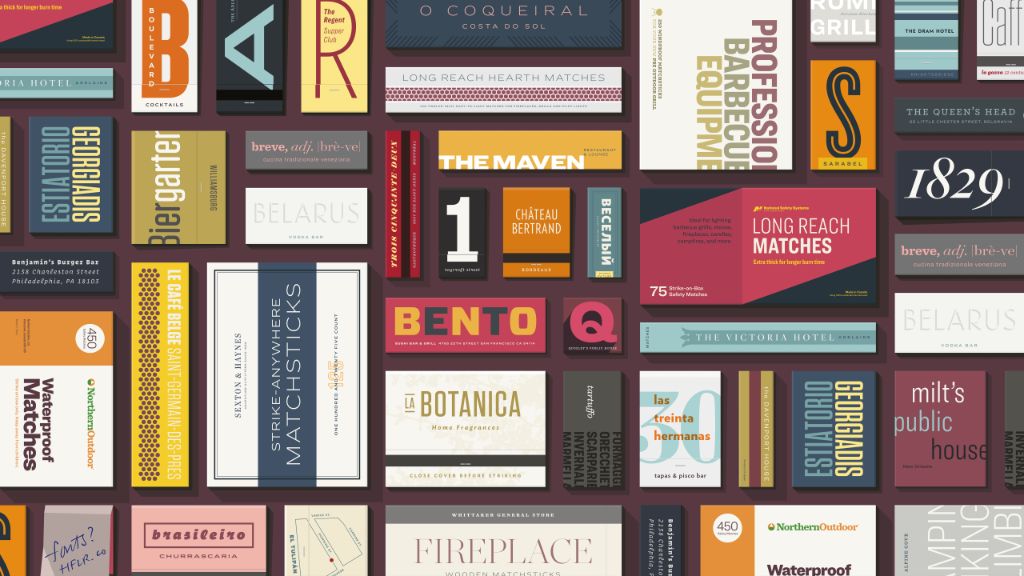
Typefaces (also called fonts or typography) are an inseparable part of website design. Using fonts sensibly lays out the content on your website professionally, provides an attractive appearance, and preserves the aesthetics of your entire site. Choosing suitable typefaces plays an important role in giving a website its distinctive style. Combining them correctly raises the effectiveness and professionalism of a corporate website design, creating better, more enjoyable on-page experiences for users and keeping visitors on the site longer. Conversely, unsuitable fonts can make content harder to read and create an unpleasant feeling for readers.
Learning to combine basic typefaces effectively is an important first stepping stone for any web designer. Skilled, seasoned designers can breathe life into even the simplest design and make it far more effective and beautiful. Once they have mastered those rules, web designers can experiment with fresher pairings to create font combinations that are unique and carry a personal signature — or even invent typography styles of their own brand.
So is there a standard formula for combining different fonts on one website?
Among the hundreds of thousands of typefaces available today, trying to figure out exactly where to start with website design can be overwhelming, even for experienced designers. Understanding the characteristics of different typefaces should be the first step, because it lays an important foundation for figuring out how to combine them later.
The 4 groups of typefaces in website design
To make this easier, get acquainted with the typeface classification system — one of the most fundamental concepts in typography in particular and website design in general. Today, most fonts fall into one of 4 groups: serif, sans serif, script, and decorative.
Serif and sans serif are the most widely used typefaces because they suit both headlines and body text. Script (often called handwriting-style fonts) and decorative (stylized, ornamental fonts) usually appear only in headlines. Fonts in these 2 groups are generally not used for paragraphs of text, or if they are, only in very small amounts.
Comparing the serif and sans serif groups in website design
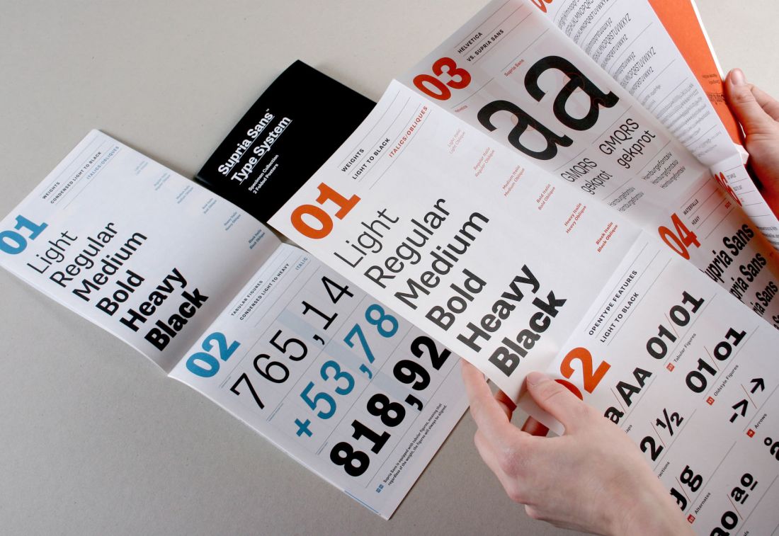
Serif fonts are believed to make long passages of text easier to read, especially in traditional designs such as print. Because of their most basic characteristic — the serifs, or feet (a small extra stroke added at the start or end of each main stroke of a letter) — these fonts help readers follow each line of text easily, making them especially useful in website designs with a lot of content.
Sans serif fonts, unlike serif fonts in that their characters have no feet, are particularly suitable and easy to read at small sizes (such as the typefaces used for captions or meta information). Sans serif fonts are widely and commonly used in corporate website design and are even said to be easier for users to read than serif faces. Part of this view dates back to the early days of the computer industry, when screen resolution was still relatively low, making complex serif fonts look slightly blurry at certain sizes. Today, however, with HD and Retina displays, this is no longer a serious issue, and we can comfortably use both font families in the same design.
How should you combine typeface groups to make a website design effective?
Combining typefaces from the same group is usually simpler and safer than combining typefaces from different classifications. The main reason is that each group has its own characteristics, and the traits of fonts from different groups are sometimes complete opposites. It is precisely because of this that you can freely and effectively combine typefaces within the same group or across groups for your website design, as long as you understand their characteristics well. Learning which font characteristics relate to each other allows web designers to combine them with confidence. That said, sometimes listening to your intuition is a direction worth trying.
Font weight in website design – How to achieve harmony?
Weight is another characteristic to consider in any website design. Thin, regular, semibold, bold, and black are examples of font weights. The contrast between the weights of different typefaces is a factor well worth considering when pairing them. Combining a very heavy font with a very thin one usually feels unbalanced. For example, a heavy font like Bevan cannot harmonize with a very thin font like Helvetica Neue UltraLight — the gap is such that the thin, light letters nearly disappear next to it.
But combining typefaces of the same weight can also be a challenge, because even within the same weight class, each font has a different degree of heaviness. Instead, when starting out with font pairings, it is easiest to look for typefaces that are clearly distinguishable but not drastically different in weight. Website designers can then branch out toward bolder contrasts. For example, the same Bevan font actually pairs well with Gill Sans.
Pay attention to x-height and the feeling a font conveys to make your website design more professional
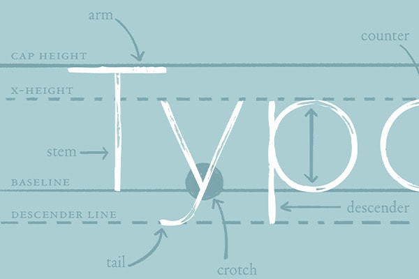
X-height is the height of individual characters in a typeface — specifically the lowercase letter x. Typefaces with similar x-heights pair better with each other than typefaces with different x-heights. For example, Futura and Century Old Style share the same x-height, so combined they produce a more pleasing visual effect than when paired with Baskerville, which has a lower x-height.
The feeling a typeface conveys is another aspect you should consider before deciding which typeface to use in your website design. A font's feel can range from formal to informal, feminine, strong, simple, serious, and so on. When combining fonts, the key is to find typefaces that convey a similar feeling to the reader. Pairing a playful font with a very serious one creates visual confusion.
Those are just a few font-pairing tips from the many "secrets" Markdao has accumulated on its journey providing website design services to its clients. With Markdao Vietnam's web design service, you don't need to worry about whether fonts are suitable — down to the smallest detail, including choosing typefaces that fit your design and industry, everything is carefully "hand-picked" by us. Let's create the best possible website for your very own business! Contact us for a consultation at HOTLINE: +84 79 993 1071 (Ms. Trinh) or Email: [email protected]
Related Articles
Bài viết liên quan

25 tháng 10, 2026 · 3 phut doc
2024年网页设计趋势预测如何? | Wotech Electronics
关于 2024 年网页设计趋势——步入 2024 年,年初正是我们为新事物预留时间的时刻。这也非常适合设计师群体唤醒我们内心的"艺术之魂"。闲话不多说,快来和 Markdao 一起浏览 2024 年的 UX/UI 设计趋势吧,说不定您就能为自己接下来的网页设计项目"迸发"出一个绝妙的点子呢!

25 tháng 10, 2026 · 1 phut doc
什么是网站(Website)?网站的详细定义及其带来的商业价值
什么是网站(https://www.markdao.com.vn/blog/website-la-gi)——这个问题或许已经无需定义,因为在如今这个信息时代,网站对每一家企业而言都是不可或缺的组成部分。正是网站帮助用户更近距离地接触企业所提供的产品和服务,从而提升经营效益。此外,要在当今竞争如此激烈的环境中求发展,网站是一个重要因素,它将带你走向品牌与销量上的双重成功。
25 tháng 10, 2026 · 1 phut doc
什么是SEO标准网站?一场"打赢"Google SEO标准的战役 | Wotech Electronics
99%的用户在购买前会先搜索信息,73%的用户只会访问排名前10的网站,并认定它们是值得信赖的品牌……在数字营销爆发的时代,这些数字有力地印证了SEO标准网站的重要性。然而,许多人对什么是SEO标准网站(https://www.markdao.com.vn/blog/huong-dan-toi-uu-seo-website-chuan-seo-on-page)仍然相当模糊,并未真正理解。达到SE…